
|
Performance
|
Visual EffectsThe Windows 10 graphical user interface incorporates a large number of "visual effects" which look neat the first time you notice them but otherwise just consume compute resources and reduce responsiveness. For example, Fade or slide Tooltips into view causes Tooltips to appear gradually rather than snapping into view. Sometimes. When they don't, two adjacent Tooltips in the same application can behave differently. Most of the visual effects are just bad ideas (like most of Windows 10) and should be turned off. This page tells you how to do it. 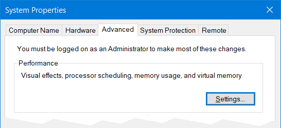 Visual effects are configured on the Visual Effects tab of the Performance Options dialog. This is accessed via the Advanced tab of the System Properties dialog (partially shown at right). Here are some ways of finding the System Properties dialog :
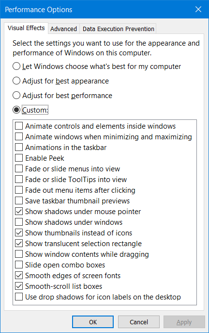 However you found the System Properties dialog, make sure that the Advanced tab is selected. Then, in the Performance pane, click the Settings... button to bring up the Performance Options dialog. Make sure that the Visual Effects tab is selected. If it isn't, then click it. So, now you can see (example at right) the list of visual effects that can be enabled (checked) or disabled (uchecked). What to do? There is also a set of four radio buttons that control the effects en masse. Adjust for best appearance enables them all. This is reasonable, as to not enable an effect would be an admission that it does not improve the appearance of the GUI, even in Microsoft's eyes. Adjust for best performance disables all the effects. This will probably not be the default as it makes clear that you're paying for these hokey fades and animations with lost performance on things you actually care about. The default may be Let Windows choose what's best for my computer. I don't know what you'll find here, so let's forget it. Instead, select Adjust for best performance and then select Custom. Now you can turn on only the effects that are useful to you. But which? I can only give my personal opinion. I don't find any of the animations or fades / slides to be useful and most are just a distraction. So, I leave them all unchecked. Enable Peek — "Peek", in this performance option, is known elsewhere in Windows 10 as "Peek at Desktop", "Aero Peek" or "Preview Desktop", depending on where you come across it. Why have one clear name for a feature when you can have four confusing ones? If you look at the extreme right hand end of the taskbar, beyond the clock and notification area, you'll see a vertical bar. Click in the tiny area to the right of this and all your windows will be minimized. Click again and things are back the way they were. This is presumably to help disorganized people who have stuff spread all over their desktop instead of in folders. Aero Peek extends this feature such that when the mouse pointer is inside the tiny right-most area of the task bar, all your windows become transparent so that you can see the desktop through them. Things return to normal when the pointer leaves the area. No need to click! Wow! I don't need any of this, so I have Peek unchecked. Save taskbar thumbnail previews — When you move the mouse cursor over an icon in the taskbar that represents an open window, a small image appears to show you what the window will look like when opened. I suppose this is to help people who lose track of what windows they have open and have to hunt around for the one they want. I rarely use this feature. If you use it a lot and your graphics is terrible, then this performance option may be a good idea for you. If you enable it, the little image is saved in a cache so that if you wander off somewhere else looking for your window and then come back again the image doesn't have to be regenerated. I have no use for this and so have it unchecked. Show shadows under mouse pointer — I check (enable) this effect option because I find that the shadow makes my tiny mouse pointer more visible over a white background. It doesn't seem to affect cursor shapes other than the pointer arrow. Show shadows under windows — Shadows under windows do nothing for me so I uncheck (disable) this option. Show thumbnails instead of icons — I sometimes find thumbnails useful in finding a particular image file that I'm looking for. Windows 10 has multiple obscure features to make the display of thumbnails difficult. I begin by making sure that this effect option is checked (enabled). You could be forgiven for thinking that this would make Windows show thumbnails instead of icons, as this is how it is named, but you still won't get thumbnails unless you also uncheck (disable) Always show icons, never thumbnails in File Explorer Options. Finally, the last step in showing thumbnails is selecting Medium icons, Large icons, Extra large icons, Tiles or Content (not Small icons) from the View menu in File Explorer for the particular folder. I usually have the View set to Details, so I can get a quick peek at thumbnails by hovering over an icon setting but not clicking it. The view reverts to showing the file date, size, etc. 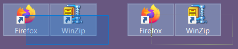 Show translucent selection rectangle — In File Explorer, you can select multiple items by clicking and then dragging. To show you the screen area that you've swept (dragged over), a rectangle appears with one corner where you clicked and the other at the present position of the mouse pointer. This "selection rectangle" is made clearer by filling it with color but the things that you're selecting remain visible because this color fill is translucent. You can also click and drag to select multiple items on the desktop (see image at right). For the behavior of the selection rectangle to be the same as in File Explorer, this effect must be enabled. Otherwise, the rectangle will not be filled and can be a little hard to see (far right). So, just check the box to enable it, why don't you? Show window contents while dragging — - what does this do? Smooth edges of screen fonts — - what does this do? Smooth-scroll list boxes — - what does this do? Use drop shadows for icon labels on the desktop — If this effect is enabled, then the text labels of the desktop icons will use a horrible smudged-looking mess of two contrasting colors, probably white and black. The point of this, unless I'm badly mistaken, is so that you can (with effort) still read the labels if you have a picture as the desktop background. This is illustrated on this Web page. However, if you're sensible and have a solid color or a simple design as your background, then you should turn this effect off to just get a straightforward appearance for your icon labels. It does seem as if the control of this effect does not always work. See, for example this page and also this page. |